Conversation
Pegasystems Inc.
IN
Last activity: 7 Oct 2025 11:05 EDT
Custom Form Validation for Search and Select
User Guide for Custom Validation for Search and Select
Author & Context
- Audience: Pega Constellation application developers
- Applies to: Constellation UX, Search & Select pattern
- Use case: Adding complex JavaScript-based validations to Search and Select fields beyond default OOTB field-type validations.
Version:
Available in Pega Platform version 25.1 and later
Problem Statement ("Why")
The Search and Select pattern in Constellation is powerful, allowing multiple search groups and criteria without adding extra properties to the data model.
However, because these properties are not defined in the data model, developers cannot easily configure advanced validations beyond the out-of-the-box field-type-based options. This gap can limit data quality enforcement in complex scenarios.
Benefits
Implementing a custom validator:
- Enables client-side validations with custom error logic.
- Allows form-level or field-level error messages.
- Improves user experience by guiding users with clear, context-specific validation feedback.
- Supports complex use cases where validation rules exceed basic constraints.
- Avoids need to create Dx component just to build a specific field validation
Prerequisites
- A case type using the Search and Select pattern with Display as “Search & Select” enabled.
- Familiarity with creating DX components in Constellation.
- Access to View rules for manual JSON editing (since UI authoring for validators is not yet available)
Example Business Usecase: Build a custom validation on Search Group capturing Employee Information
Configuration Steps
Step 1 Create DX Validator component based
Create a custom DX component that:
- Registers with PCore.getFieldDefaultUtils() to enable validations.
- Defines custom validation logic via PCore.getFormUtils().setCustomValidator().
- Optionally uses PCore.getMessageManager().addMessages() to display errors at:
- Target field level
- Validator component placement
import { useEffect } from 'react';
import { Banner } from '@pega/cosmos-react-core';
export default function SearchGroupValidator(props) {
const pConnect = props.getPConnect();
useEffect(() => {
// Register Dx Component with defaults api to
// 1. enable client-side validation
// 2. enable showing error when empty
PCore.getFieldDefaultUtils().updateFieldDefaults({
SearchGroupValidator: { 'client-validations': true, showErrorWhenEmpty: true }
});
// Register custom validator for Dx Component name
PCore.getFormUtils().setCustomValidator(‘SearchGroupValidator’, (value, options) => {
// get Context State to access other fields
const contextObject = PCore.getStore().getState()?.data[`${pConnect.getContextName()}`];
// Build your validation logic here
let message;
if (<contextObject add_conditions_1>) {
message = 'error message 1';
}
if (<contextObject _add_conditions_2>) {
message = ‘error message 2’;
}
if (message) {
PCore.getMessageManager().addMessages({
messages: [
{
type: 'error',
message
}
],
context: pConnect.getContextName(),
property: 'target_propety_id', // .Object.Prop notation
pageReference: pConnect.getPageReference()
});
}
return message;
});
}, [pConnect]);
return <>{props.validatemessage && <Banner variant='urgent' messages={[props.validatemessage]} />}</>;
}
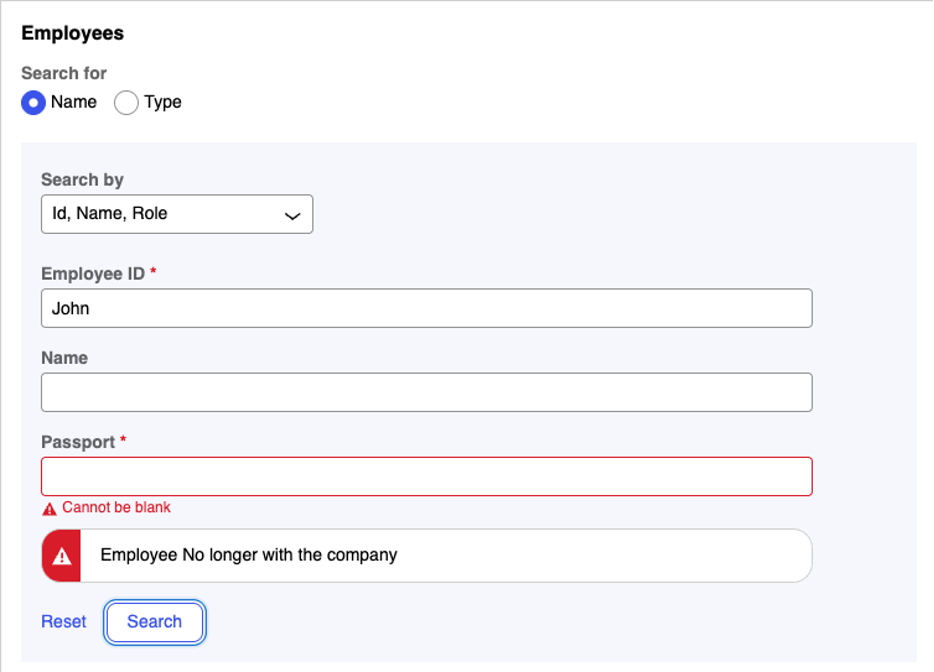
Error Display Option
- To show it as Error on any target field
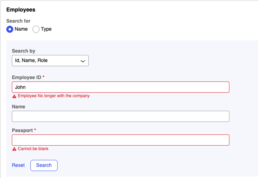
Use the PCore.getMessageManager().addMessages({})Ex.
PCore.getMessageManager().addMessages({
          messages: [
            {
              type: 'error',
              message
            }
          ],
          context: pConnect.getContextName(),
          property: '<property_path>',
          pageReference: pConnect.getPageReference()

        });
Note: You should return `<></>` from the Dx component in this case to not show repeated errors on forms.
- To show it as Error on Validator Component, (Placement of error can be based on the ordering of Validator component when authoring the Search Groups.
Step 2
Use this custom component to write your custom validation for the Search Group
As this option is not exposed via UI-Authoring currently, this needs to be edited in View Rule itself. Mark the view, as Custom and enable editing as described below.
Note: You can use the Info icon, to find the view name
"searchGroups": [
   {
    "type": "SearchGroup",
    "config": {
     "id": "SearchGroup_y0lzl3y0l",
     "label": "@L Id, Name, Role"
    },
    "children": [
     {
      "type": "TextInput",
      "config": {
       "value": "@P .Employee.EmployeeID",
       "label": "@L Employee ID",
       "required": true
      }
     },
...
     },
     {

      "type": " SearchGroupValidator", // This should be set as Validator Dx Comp Name
      "config": {
       "validator": true, // Must be a validator: true config
       “required”: false, // Should not be a required property
       "isContainerWidth": true”, // forcing the error to take available width (Optional)
       "value": "@P <valid_property_on_reference>",  // any valid property from data model which does not need to participate as search fields.
       "label": "@L <valid_property_on_reference>",
      }
     }
    ….
    ]
   }
Note: You can associate this validator component with any available field on the Class. Note that the Validator field itself does not participate in the validation process.
Caveat
This is exactly a dx-component building process and requires advanced constellation and react understanding, but in this case build to extend validations for Search and Select Pattern. Use this is a reference point.
More Resources
- https://academy.pega.com/topic/creating-constellation-dx-component/v1
- https://docs.pega.com/bundle/platform-242/page/platform/user-experience/configuring-search-select.html
- Available for Pega Infinity '25
Constellation 101 Series
Enjoyed this article? See more similar articles in Constellation 101 series.