Conversation
Nationwide Building society
GB
Last activity: 5 Feb 2026 8:58 EST
Banner widget automatically collapsing when it has 3 of more records
We have imported the banner widget from UI galley and have it successfully working, but we notice when it has 1/2 records it loads expanded but when it has 3 or more it loads collapsed. Is there a way to alter this so it's expanded even with 3 or more records?
Novitates
IN
Finding: OOTB behavior confirmed
The Banner component from @pega/cosmos-react-core (v8.4.1) sets the initial collapsed state based on message count.
Source code evidence:
In /node_modules/@pega/cosmos-react-core/lib/components/Banner/Banner.js at line 135:
const [collapsed, setCollapsed] = useState(count > 2);Behavior:
- 1–2 messages: starts expanded (collapsed = false)
- 3+ messages: starts collapsed (collapsed = true)
Configuration options
The BannerProps interface (from Banner.d.ts) does not expose a prop to control the initial expanded/collapsed state.
Available props:
- variant
- headingText
- headingTag
- messages
- onDismisshandle
No prop like defaultExpanded, initialExpanded, or expanded exists.
Conclusion
- This is OOTB behavior and cannot be configured via props.
- To change it, you would need to:
- Wrap the Banner and manage expand/collapse state externally, or
- Use a custom Banner implementation, or
- Wait for a library update that adds this prop.
Below is the github link where we did a POC with option 1 and added few changes to the current component to make it work as per your requirement.
We have added a new flag to the component named "defaultExpanded". If you pass it as true, then regardless of the number of items in the banner it would show as expanded by default on load.
Important Note: This component code might not be PROD ready and is only intended to showcase the POC of the above mentioned requirement. Please ensure to review it with a seasoned UI developer and make changes if any/needed before you take it to higher environment.
Hope this helps. Happy coding !!!
Regards
JC
Pegasystems Inc.
GB
@JayachandraSiddipeta thanks for your detailed response. I would not have thought of option 1 honestly.
@HollyG17369606 I would of suggested option 2, build your own custom implementation of Banner. The Constellation UI Gallery is an open-source library, it is intended to be customized by projects to meet your specific needs, whilst also providing inspiration for the art of possible and best practices when using Pcore/Pconnect APIs.
We had a webinar recently on DX Components. @ongf1 and @Josh Helmbrecht do a much better job of explaining it :)
Nationwide Building society
GB
@JayachandraSiddipeta Thank you for this information, when you refer to available props, I cannot locate headingText and headingTag in the current src code. I'm interested in this as a potential to change our banner heading from the variant options warning/information etc to something more specific to our use case. Is this possible or would we need to publish our own component to do this?
Novitates
IN
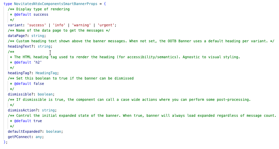
Banner component accepts headingText and headingTag and uses them as below:
- headingText – Custom heading text.
- headingTag – which HTML element to use for that heading (h1–h6), e.g. forwardedAs: headingTag so you get <h1>, <h2>, etc. in the DOM.
What the OOTB Banner does not do,
- It does not change visual styling (size/weight) based on headingTag.
It always uses the same Text variant for the heading (effectively “h2-style” visually), so the UI looks the same whether the element is <h1> or <h6>. The API even describes headingTag as “agnostic to the styling of the heading.”
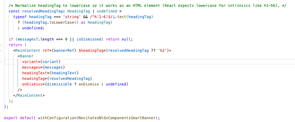
What we did in the SmartBanner wrapper,
Banner component accepts headingText and headingTag and uses them as below:
- headingText – Custom heading text.
- headingTag – which HTML element to use for that heading (h1–h6), e.g. forwardedAs: headingTag so you get <h1>, <h2>, etc. in the DOM.
What the OOTB Banner does not do,
- It does not change visual styling (size/weight) based on headingTag.
It always uses the same Text variant for the heading (effectively “h2-style” visually), so the UI looks the same whether the element is <h1> or <h6>. The API even describes headingTag as “agnostic to the styling of the heading.”
What we did in the SmartBanner wrapper,
- Expose and pass through – We added headingText and headingTag as SmartBanner props and pass them to the OOTB Banner. So the OOTB still does the semantic part (correct tag in the DOM).
- Add visual styling – We added wrapper-level CSS in our styles that targets the heading by level (e.g. [data-heading-tag='h1'] h1, etc.) and sets different font sizes/weights. That “h1 bigger, h6 smaller” behavior is only in our wrapper, not in the OOTB component.
So: headingTag (and headingText) are in the OOTB and control the element; the visual styling that changes with headingTag is not in the OOTB and we implemented it in the wrapper as shown below.
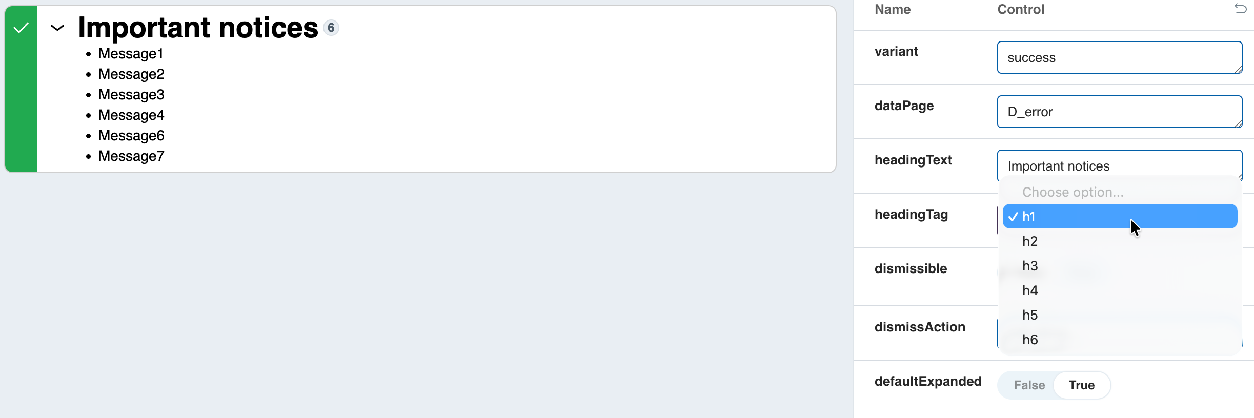
After the implementation it looks something like below,
In short, when you build your own component, you can utilize the OOTB attributes provided in the Banner component in the above manner with a bit of adjustment to make it look and work better.
Hope this helps
Regards
JC