Conversation
Pegasystems Inc.
US
Last activity: 3 Dec 2025 14:10 EST
Customizing the Constellation Loading Indicator: A Simple CSS Approach
The Constellation design system provides a clean, out-of-the-box user experience, but sometimes you need to inject your own branding or style. This article shows you how to easily replace the default loading indicator with a custom one using a minimal CSS-based technique.
Requirements for the custom loader
Constellation imposes strict but simple requirements for the custom loading indicator to ensure performance and proper rendering:
-
Single Element DOM: The loading indicator's structure must be limited to a single
<div>element. Nested elements are not permitted. -
Compact Size: The visual shape should be a square with a maximum width and height of 32px.
These constraints mean you must rely entirely on CSS—specifically borders, gradients, box-shadows, and CSS animations—to create the visual effect.
Finding Your Custom Loader
Creating a complex, single-element loader from scratch can be challenging. Fortunately, many resources provide excellent, constraint-compliant examples.
-
CSS Loaders: Check out sites like https://cssloaders.github.io/ or https://freefrontend.com/css-loaders/. Look for examples labeled as "single-element" or those that use only a single
divin their HTML structure.
Pro-Tip: Once you find a suitable loader, you will only need to copy the CSS portion; the HTML is simply a single
<div>.
Implementation: Overriding the Default CSS
To implement your custom loader, you need to override the default CSS rules within the Constellation platform. This is done by adding a custom stylesheet to your application's framework.
Step 1: Access the Platform CSS File
Constellation allows you to add custom CSS to your application, which is the perfect place to inject your override.
-
Refer to the official documentation on Adding Fonts and Custom CSS in Constellation to ensure your custom CSS file is correctly included in the platform.
-
If you are using Web-Embed - you can use the 'customCSS' attributes available in Pega '25 - see Attributes in web embed
Step 2: Define the Custom Loader CSS
The Constellation loading indicator is a div with the role 'progressbar'. You need to target this element and apply your new styles.
-
Target Selector: The element that you need to target is div[role="progressbar"]
-
Example Override Structure:
CSS
/* We are hiding the default loader */
div[role="progressbar"] > svg { display: none; }

div[role="progressbar"] {
    /* 1. Reset and Constraints */
    width: 30px !important;    /* Square: W <= 32px */
    height: 30px !important;   /* Square: H <= 32px */
    margin: 0 !important;      /* Ensure proper positioning override */
    background: none !important; /* Clear any default background */

    /* 2. Spinner Appearance */
    border: 3px solid #f3f3f3;       /* Light grey track for the spinner */
    border-top: 3px solid #E94B35; /* Colored spinning segment */
    border-radius: 50%;              /* Makes it a circle */

    /* 3. Animation */
    animation: custom-spin 1s linear infinite;
}

/* Define the Animation Keyframes */
@keyframes custom-spin {
    0% { transform: rotate(0deg); }
    100% { transform: rotate(360deg); }
}
By placing your chosen single-element CSS code within the CSS selector, you effectively replace the default indicator with your custom, branded experience.
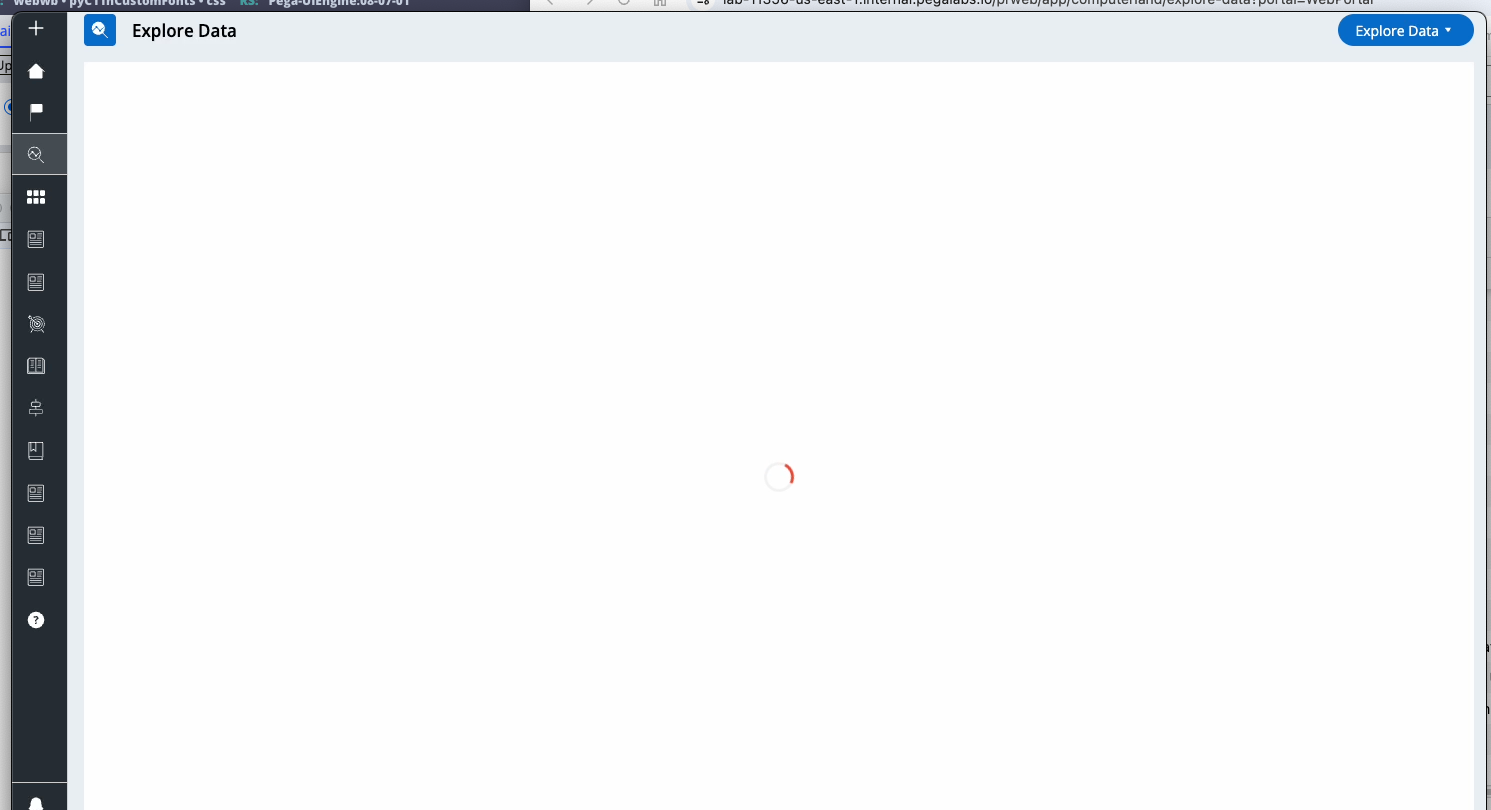
Here is an example of the custom loader
Constellation 101 Series
Enjoyed this article? See more similar articles in Constellation 101 series.